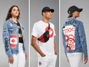
HBC with some super-casual denim and tees… right in the Canada wheelhouse.
Custom merchandise buyers, sellers and apparel decorating nerds (like us!) can learn a lot watching the Olympics! Look at those opening ceremony outfits, team uniforms, podium outifts, and competition wear! Let’s break down some of the winners, losers and honourable mentions at Tokyo 2020 this summer.
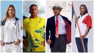
Great example of semi-formal to athletic sportswear.
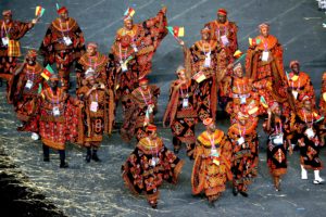
Now THIS is how you get a party started. Wow!
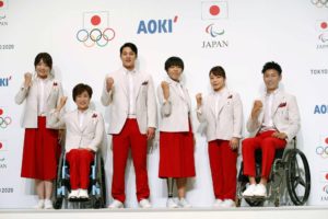
Athletes pose with official uniforms for the Tokyo Olympic and Paralympic opening ceremonies during its unveiling event in Tokyo, Japan in this photo taken by Kyodo January 23, 2020. Credit: Kyodo/via REUTERS
Now, a couple of quick fails. Here’s a decorating fail and something custom merch clients & designers should heed. The Italian pac-man on belly flag? What the hell were they thinking? It is the most unflattering logo position and shape that makes buff athletes look chubby. It prob looked “okay” in 2-D full colour line drawings on computer monitors but in real life? Never, ever do this:

Italian Team with Horrid Flag/PacMan belly logos.
Mixing primary colour palettes with secondary colours? This was a great lesson for me to learn because I often push clients to think beyond their corporate Navy or Red. Yes, complimentary primary colours can work BUT be careful. Stray to far and it looks bizarre.
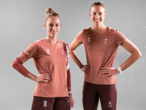
Swiss: is this even a colour?
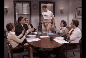
USA Swimming Boardroom.
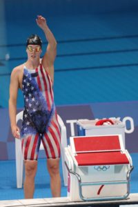
From the Will Ferrel ideation phase to actual competition –>